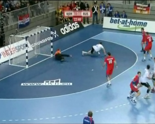
 Currently there is handball world championship in Croatia. I am not such a big handball fan so I don't even plan to visit any game (played some 20 minutes of walking distance) but I do plan to watch it on TV few times.
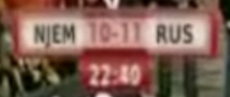
I was at my parents place yesterday doing some unrelated work, but with TV near it was difficult not to scan a result from time to time. I cannot help it if I am curious person. But my curiosity had huge problem (or small one) - font and coloring of part that was displaying game result. Somebody - I can only assume professional designer - decided that red numbers on light red background should be used.
I do wear glasses when I work on computer but my vision is good enough to be able to do all other tasks without them (those who are familiar with my habit of loosing glasses everywhere know that I also do programming for few days without them). If I cannot be sure what numbers do I see on it on 72cm TV from other side of room, my father had no fighting (seeing) chance.
 I give you enlarged part of that (captured and cropped from RTL's own video at resolution of 1280x1024). On this picture you can see how really close colors are.
I am angry when vision of some designer (or even worse - designer comity) decides that need for fire theme is more important than actual readability of final solution. I can partly understand their (probable) excuse. They were all doing work on high-resolution, high-fidelity monitors and that problem was not visible there. What was missing was that final testing phase: looking at whole thing from user perspective. User perspective in Croatia is still CRT TV and HD is rarely to be found.
There is real lesson to be learned here even for application development. Always test your program in your user's environment. "It works on my system" is a poor excuse for user.